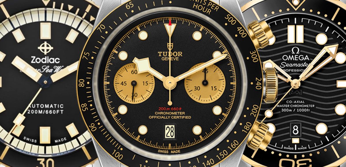
Just Because: Five Ways To Rock Two-Tone
The love-or-hate option with a heart of steel and gold.
Originally published by James Stacey on HODINKEE, April 17th 2020
With select few exceptions, along my path to a deeper appreciation (read: love) for gold watches, my taste for two-tone watches has transitioned from a sort of general indifference to that of a loose, even nebulous, contempt. While not exclusive, the general vibe hits me as dated but not in a compelling way. And, while I am sure two-tone will one day rise to popularity, as hard as I’ve tried, I’ve only been able to warm up to a handful.
Below, I offer up a few examples with the hopes of highlighting two-tone methodology that feels thoughtful, fun, and maybe even stylish. Also, in the interest of variety, I’ve omitted the usual suspects from Rolex and Patek as you (1) likely already know of their existence and (2) you likely cannot buy them anyways. Finally, I know that there can be considerable concern for the qualities of solid gold vs. gold plated vs. gold tone. In my mind, as long as the application of gold matched the price point for the watch, none of the options bothers me, and I’ve certainly had a great time with less costly non-solid examples. With that out of the way – steel and gold (roughly) – let’s do this.
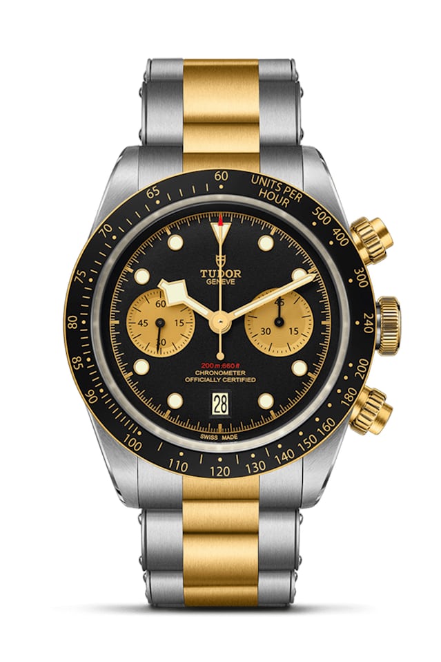
The Tudor Black Bay Chrono S&G
Full disclosure, this watch is the whole reason that I decided to develop the following list. It’s easily the first time that I really liked a modern two-tone watch and, when paired up with a simple leather strap or maybe even a Redford-esque bund strap (aka.The Heaton), I think it’s downright cool. The winning move here is the ample contrast between the gold elements and the black of the dial and bezel. Extra points for the gold-tone subdials, the quality chronograph movement, the strong date execution, and the extra-strong lume. In this expression, the Tudor Black Bay Chrono S&G is both one of my favorite modern chronographs and one of my favorite current-gen offerings from Tudor as it offers an automotive-themed ’70s vibe that feels like an excellent home for a certain Midas touch. Final thought, I bet it would SING on a grey NATO.
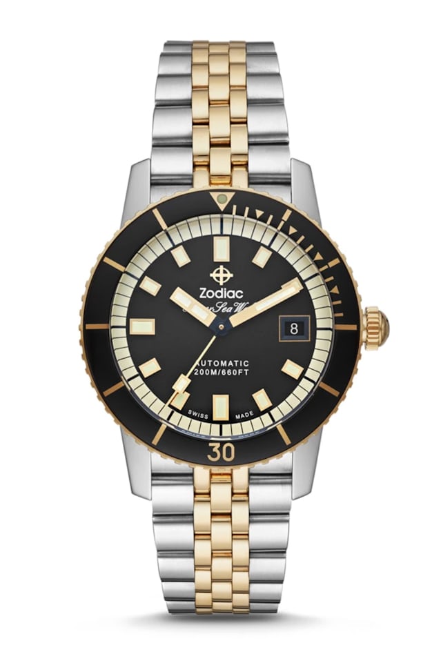
The Zodiac Super Sea Wolf Automatic
Not unlike the Tudor above, this Zodiac pads the somewhat glittery vibe of the two-tone with a black bezel and dial. Interestingly enough, this is one of the very few examples which, to me, looks pretty solid on its tapered five-link bracelet. While this iteration lacks the outright fun of its more colorful siblings, I think the execution is deft, and it’s hard to argue with the price point for this 40mm 200m water resistant diver (13mm thick and 49mm lug to lug). It’s a handsome vintage-inspired dive watch that actually stands out from the usual due to its use of gold-tone accents. With a Swiss automatic movement and a sapphire crystal, the Super Sea Wolf is a great way to try two-tone without spending a pile of your own hard-earned gold.
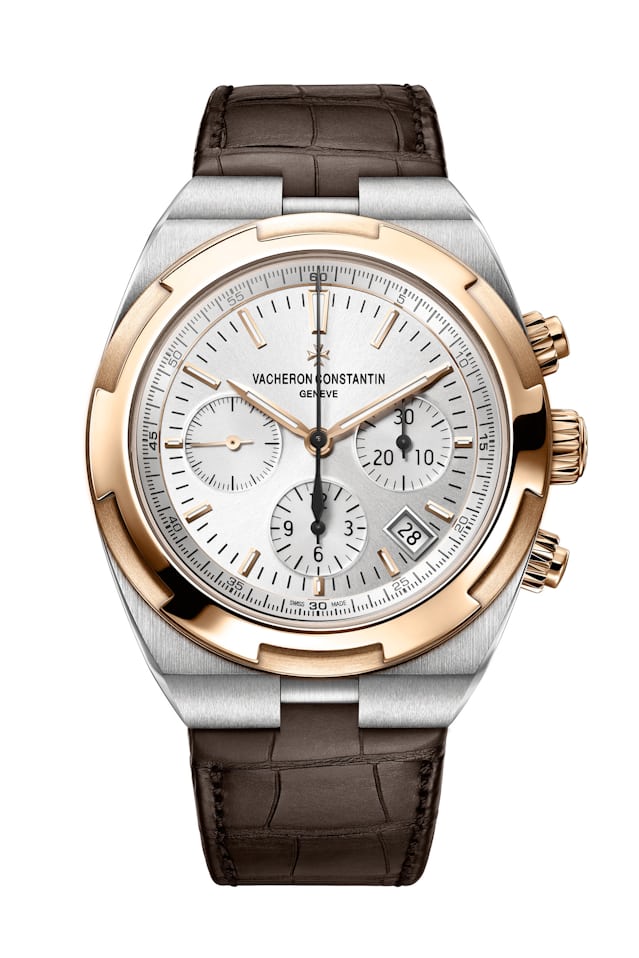
The Vacheron Constantin Overseas Chronograph
This may seem like a strange and quite expensive selection, but as we are avoiding Rolex and Patek (and because I firmly believe that Royal Oaks should either be steel or gold, not both), I wanted a quality high-end non-diver option with a complication. Thus, the 42.5mm VC Overseas Chronograph in steel and 18k pink gold. I like this because of how the gold is offset by its brown leather strap and the silver/gold dial layout. While I am decidedly not crazy about the 4:30 date, the Overseas is such a sweet watch in person, and I think the format works well in two-tone and would be so much fun on a rubber strap (maybe blue?). With 150m water resistance and a lovely in-house chronograph movement, the Overseas is an interesting and beautifully made bit of competition for known quantities like the Royal Oak or even the Daytona.
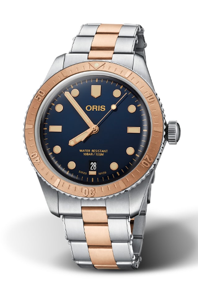
The Oris Diver Sixty-Five “Bi-Co”
While not gold proper, this steel and bronze example of Oris’ much loved Sixty-Five diver blends a really simple use of bronze to offer a special take on the idea of two-tone. Matched with a deep blue dial and matching gold-tone accents for the markers and hands, like the Zodiac, this Sixty-Five stands out from other vintage dive watches simply because they went for an Oris take on two-tone. It’s 40mm wide, quite nicely made, and the warm tone will change over time as the bronze oxidizes. The Sixty-Five is a class fav for a reason, but if you’re looking for an outlier that still maintains the charm, the Bi-Co is the way to go.
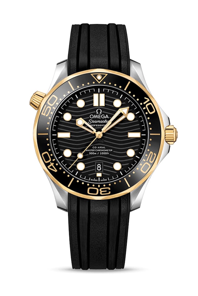
The Omega Seamaster Diver 300M
While the appeal of the Seamaster Diver 300M requires little explanation (if you need some education, Cole’s got you covered here), this specific variation is sneaky cool. Again, we see a strong use of black as a way to pad the gold accents to maintain a modern and lux feel that that is just perfect on a black leather strap. The contrast is strong, and the look is nicely matched by the high-low of a gold diver on a sport rubber strap. Given the 42mm sizing, the tech-forward Master Co-Axial chronometer movement, and the entirely dive-ready format, this is a go-anywhere do-anything diver, but, you know, make it fashion.

Get More Articles Like This in Your Inbox
We're constantly creating great content like this. So, why not get it delivered directly to your inbox? By subscribing you agree to our Privacy Policy but you can unsubscribe at any time.