Buying, Selling, & Collecting The Audacious Design Of 1970s Patek
The ’70s gave way to experimental design across the board. Was Patek Philippe the clear victor of ingenuity?
There is no period as visually defined as the 1970s – at least in my mind. It was a benchmark decade for all things experimental, wavy, and technicolored.
But beyond the cliched veneer of polyester leisure suits and platform shoes, sunken living rooms, and Cher in Bob Mackie outfits (FYI, I am spiritually guided by ’70s Cher, so this one’s personal), there was a total revolution happening in every corner of the design world: graphic design, industrial design, and interior design, as well as architecture and fashion all experienced an explosion in color and shape.
The decade was sandwiched by a period of liberation (the swinging ’60s) and a period of excess (the very gaudy ’80s). A middle-child decade led by counter-culture that somehow maintained freedom of expression despite civil hardships and an extreme economic downturn.
Let’s call the 1970s a reactionary swing of the aesthetic pendulum to the more staid look of the ’50s and ’60s. And design in horology was no exception.

Phil Toledano’s beloved ref. 3733/1G.
Of course the Patek Philippe 1970s design storyline is most obviously an action/reaction to the Quartz Revolution. In the face of new technology, Swiss brands had no choice but to get experimental. Despite the Caliber Beta 21 (which we will get into later), “there seemed to be a reluctance to put quartz on the wrist,” writes journalist and author Nicholas Foulkes in his book Patek Philippe: The Authorized Biography. “This preference was not a formal policy, more of a tacit unconscious cultural stance.”

A heady collection of white gold 1970s Patek watches on mesh bracelets.
I sat down with artist, watch collector, and Talking Watches alum Phil Toledano to talk through his collection of (self-described) “audaciously designed Patek Philippe watches” from the 1970s to examine, from a design perspective, exactly what went down at Patek in the face of crisis. And perhaps how in the face of adversity, Patek created its most innovative and elegant designs to date.
“These watches are like a small Haiku – a tiny perfect sentence,” exclaimed Toledano. “Every word in that sentence is perfect. Every bit of punctuation is perfectly placed.” The first watch I picked up from the table was ref. 3588/2G, a 35mm self-winding, white-gold Calatrava from 1974 with a Chevron pattern engraved on the dial as well as the mesh bracelet. The continuity of the pattern from dial to bracelet is something Toledano has (self) branded as “Continuous Concept,” a technique I have also seen executed in vintage Piaget. This technique turns the overall essence of the watch into a sculptural unit, an object that is fluid yet entirely whole: it’s a pattern on a loop that doesn’t exclude the actual watch from participating in this jewelry-like driven design. The case melts into the bracelet, but rather cleverly the painting of the Breguet numerals on the dial act as a playful nod to deeply traditional horology and reminds you that this is indeed a storied watch brand. “This is probably the most punk rock that Patek ever was – it’s the Sid Vicious of Pateks,” laughed Toledano.

“Continuous Concept” Chevron dial and bracelet – Ref. 3588/2G.


During the Quartz Crisis, Patek leaned into its identity as a brand that celebrated craftsmanship, with notable campaigns featuring slogans such as Patek Philippe. Hand Crafted and A Tribute To That Wondrous Tool: The Human Hand. Despite being created at the tail end of the ’60s, the Ellipse stood firmly as a symbol of Patek in the 1970s. And not only as a watch but also as a range of jewelry, cufflinks, lighters, and more: a clear token of the freedom to experiment. The Parisian goldsmith Georges L’Enfant made astrological pendants suspended within a golden braided Ellipse shape, and 18-karat white and yellow gold Ellipse shaped lighters were guilloched and decorated with enamel. The Ellipse marked simplicity of design but also a canvas for artisanry.
As the world went one way with quartz, Patek went another by carrying on the production of high-quality mechanical movements: “It became a race to have mechanical watches that were thinner and more accurate than the competitors. That’s what elegance was dictated by,” explained Patek Philippe connoisseur and founder of Collectability John Reardon. “There’s the phrase ‘ultra-thin’ you see over and over again through all the watch companies for that period of time.” Certainly, the use of mesh bracelets was part of that.

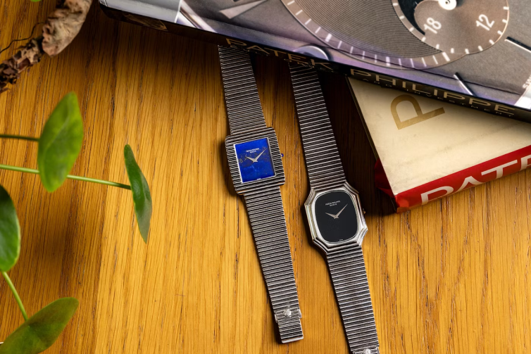
A Lapis Lazuli ‘Skater’ ref. 3578/1G.
Components during this period, including cases and bracelets, were often outsourced – which points to the fact that a lot of watches around this time looked remarkably similar across brands. I asked Toledano if he thought there was perhaps a tiny smidge of brand brainwashing for enthusiasts in the space – hence his dynamic cheerleading for ’70s Patek as opposed to, say, Audemars Piguet or Vacheron Constantin.
“When you look at that ’70s Patek stuff,” he said, “it seems to me that whoever was running the show had a very clear chain of command from the top down. It was a clean idea. A vision executed without a host of committees.” Toledano’s beloved Ref. 3729/1G features a case from Atelier Réunis, the case maker who first executed the brand’s in-house designer Jean-Pierre Frattini’s original Ellipse shape and design to Patek’s specs. In 1975, Patek officially acquired Ateliers Réunis, and although they were responsible for making some of the most important Patek cases to date, including ref. 3970, the Nautilus and the Calatrava ref. 3919, they continued to supply other watch manufacturers up until the early 2000s.

Ref. 3729/1G
What truly classifies ref. 3729/1G, as a product of the ’70s, aside from its integrated case and bracelet, is the intensely sculptural design. The purity and simplicity of the onyx dial lets the metalwork stand as the principal structural element, but it all works together as a harmonious unit. We can look at the watch as a whole piece, a whole form.
The stepped bezel and “Tubagaz” design of the bracelet on ref. 3729/1G is extremely reminiscent of popular furniture design of the time. The reptilian-like bracelet is akin to famously designed works such as the De Sede “Non Stop” modular sofa. or the slightly more accessible and compact Togo sofa, both of which are made up of multiple lines or what I like to think of as vertebrae. The tactile nature of the bracelet on ref. 3729 imbues the watch with a kind of sensuality, which late designer and engineer Bruno Munari would have categorized as “the useful being married with the sensual.” Design from the decade was often an attempt to reach totality. “There is a totality of objects but also a totality of art, architecture, and design. It’s all part of the same visual language,” writes Munari in his highly esteemed opus, Design As Art.

Ref. 3733/1G evokes a similar design quality, but this time with a rectangular and lapis dial, and continuity of case to bracelet. The focus for Patek during the ’70s was clearly on form, texture, and weight. “These bracelets are Mithril,” joked Toledano. But in some ways, I agree that there is a mythical quality to both these mesh and tubular forms in Toledano’s collection. With a sort of kaleidoscopic effect and emulation of organic texture and form – snakeskin and bark: Horological LSD.


These references represent what was clearly an inevitable reaction against the infatuation with technology. Much unlike, say, the Centre Pompidou, designed by Renzo Piano, Richard Rogers, and Gianfranco Franchini in 1977, which was truly an important material representation of the triumph of technology (and has always reminded me of Swatch Jellyfish, but I digress). The Pompidou flaunted everything people had previously tried to conceal with its external escalators inside of glass tunnels and brightly color-coded and exposed service systems – strikingly similar to today’s approach to aesthetics in watchmaking and the focus on openwork and skeleton dials. But Patek, in its somewhat staunch techno-cynicism with regard to wristwatches, opened up a whole new design language for itself in the ’70s. “What Patek was saying was, ‘look what we can do, and there’s not even a clear caseback in sight'” explained Toledano.

Milanese snake (ref. 3604/1G) and cheese grater (ref.3597/2G) bracelets.
Quartz technology wasn’t completely disregarded by Patek Philippe. In fact, high-precision electric technology was fervently employed in various large-scale and tabletop clocks made by the brand. The brand did however help develop the Beta 21 (named for the 21 Swiss watch companies involved in the lengthy process), which they launched in 1969 – it marked the beginning of Patek’s foray into quartz wristwatches. The Beta 21 was created as a two-piece case, and was made, once again, by Atelier Réunis. Unusually cumbersome in size, it lies in direct contrast to the ultra-thin look that was being executed on the mechanical side of the Patek spectrum; an ultra-thin standard which was notably upheld by caliber 240, launched in 1977.
Ref. 3603 (pictured below) is an interesting intersection of the Ellipse shape with quartz movement, while ref. 3597/2G, wider, and in white gold, features a “cheese grater” style bracelet. In all honesty, I stayed well away from this bracelet, given my trypophobia. Irrational fears aside, the novelty of design was still upheld in this reference, despite the quartz movement. Beta 21 was a quartz watch with a very analog dial. There would be no sign of LED or LCD displays or anything quite so retro-futuristic for Patek Philippe.

Ref. 3603J Beta 21
I picked up Toledano’s diamond skater ref. 3506/2G and communicated my sheer relief that he had held onto said watch after communicating a possible desire to let it go. This is the most elegant of them all. A slither of white gold with two vertical lines of baguette diamonds – the sort of intentional design that one cannot find anywhere for a reasonable price on the modern market. It’s an object I deem perfect in execution, but a watch that I would most likely cast aside in favor of something bolder with more presence. Perhaps this statement speaks for itself and our approach to watch design and consumption today: objects are only valuable because of the value we assign to them.

The very elegant diamond ‘Skater’ Ref. 3506/2G.

Currently, the watch market is far more focused on visibly flaunting its contents. Toledano named our current phase of watch design “The modern Rococo period,” and although that is something of a disparaging remark, I am inclined to agree. With the rise of independent watchmaking and the popularity of brands like Richard Mille and MB&F, the focus seems to be on skeletonization, floating subdials, and flying tourbillons. While The Nautilus was Patek Philippe’s true entrance into the modern age, a lot of the modern experimental ’70s design was an important period that seems somewhat forgotten (bar a small group of enthusiasts today). Although the design was experimental, it was often a singular expression of an idea. There was very little to distract.
“If something’s off-kilter, if something is off balance, you see it immediately,” said Toledano. “Everything about those watches, to me, is beautifully considered.”


Get More Articles Like This in Your Inbox
We're constantly creating great content like this. So, why not get it delivered directly to your inbox? By subscribing you agree to our Privacy Policy but you can unsubscribe at any time.
Pingback:The Audacious Design of 1970s Patek: Buying, Selling & Collecting – Ted's Take | October 30, 2023
|