How To Look At A Watch: A Purely Personal Take
A look at what I look at when I’m looking at a watch.
A few weeks ago, I got an interesting question from someone I work with here at HODINKEE, which was so simple and straightforward that I was kind of floored. The question was, what do I look for when I’m looking at a watch – in other words, how do I evaluate a watch that I’m getting ready to write about?
The more I thought about it, the less clear the answer seemed to me and I realized that despite the number of years I’ve spent doing this, I’d never really thought systematically about how I approach the problem. After a lot of thought (and some embarrassment about never having considered the question before) here’s what I came up with.
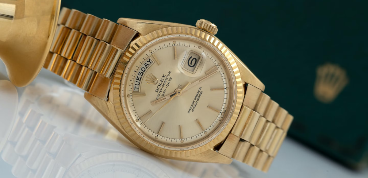
First of all, there’s the first gut reaction – which can be anything from Wow to WTF, depending on the watch (and other imponderables, like whether I’ve had my first cup of coffee yet or not. More criticism depends on the critic’s blood sugar levels than you might suspect). While this is the basis for everything that comes after, it doesn’t happen in a vacuum. If I’m looking at a simple two-handed dress watch in a precious metal, there are the dozens (hundreds?) of others that I’ve seen, lurking in the background. If it’s a watch from a brand I’m familiar with, and part of a familiar product line, my reaction – even the first gut take – happens in the context of prior exposure and knowledge.
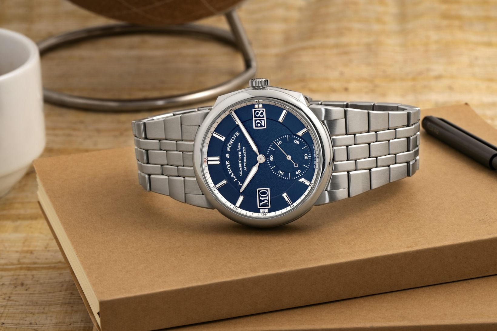
Lange & Söhne Odysseus, from A Week On The Wrist.
If I’m seeing a watch for the first time on the basis of press images, I don’t look at it the same way as if I’m seeing it in person. No matter how good press release images are (and they range from technically good but unimaginative, to very complete and varied, to hopelessly bad both technically and from a style standpoint, and everything in-between) they are no more a substitute for real-world handling, for a watch writer, than writing up a new car just from brand-provided images and specs is for a car writer. (I have, and so has every watch writer, seen five-figure watches photographed with less imagination than Bounty uses for shooting rolls of paper towels).
That said, you can often make a pretty good guess as to what the in-person impression is going to be if it’s a brand or model you know. The tricky bit is when it’s something new and different. Fairly recently, we had our first look at the Lange & Söhne Odysseus. My first exposure to the watch was, natch, press pictures and I immediately had my doubts. This was new territory for Lange and I was far from convinced that it worked. When I saw the watch in person, though, it was a different story – it had an authority to it that made it much less of a foregone conclusion that Lange had swung and missed, and I warmed up to it pretty fast.
The second question I always ask is more deliberately objective. I think a lot of folks think “do I like it?” is the most important question when you’re evaluating a watch. For potential consumers, in general, it is. For serious watch enthusiasts, though, and for watch writers, I think a much better question is, “what kind of watch does this want to be, and how well does it succeed at that goal?”
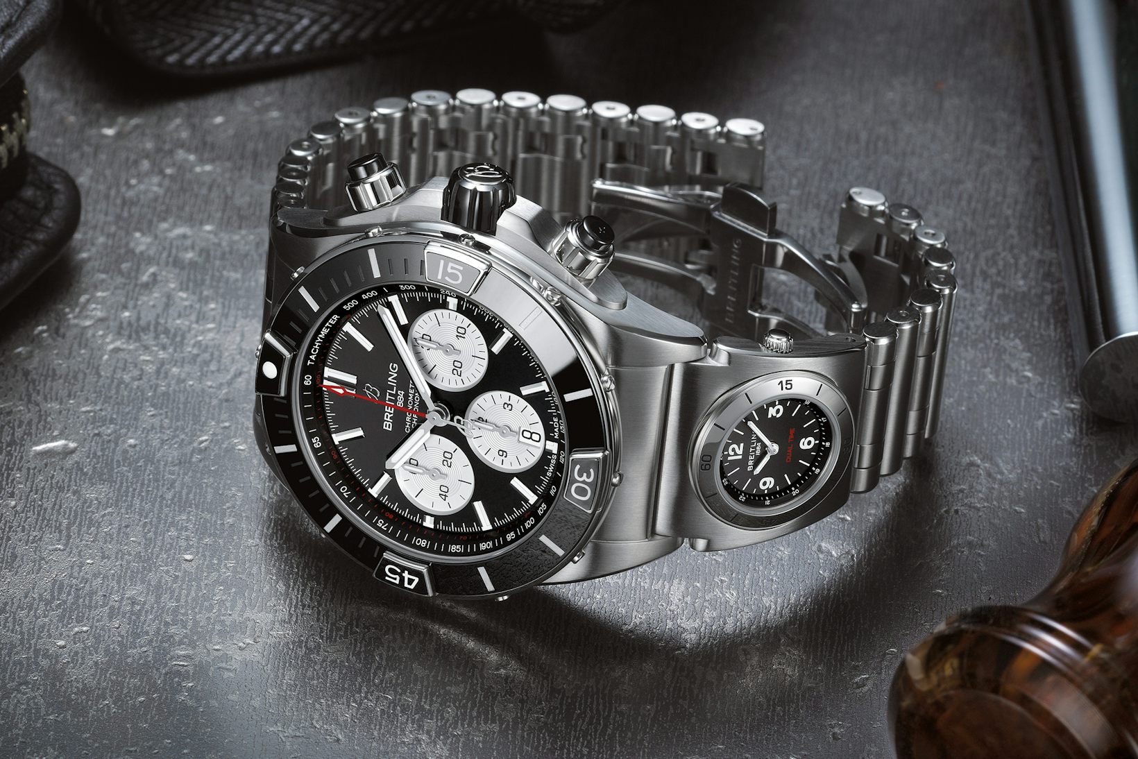
Breitling Super Chronomat, 44mm.,
Failure to consider this question is what leads to reactions like, “That 44mm sports chronograph with 500 meters of water resistance is a disaster, lol. I will stick with my 38mm vintage two-register chronograph, lol.” If a company is making a 44mm steel sports watch capable of hitting saturation-diving depths, they are just so obviously not trying to make a soigné cosmopolite’s elegant sports watch.
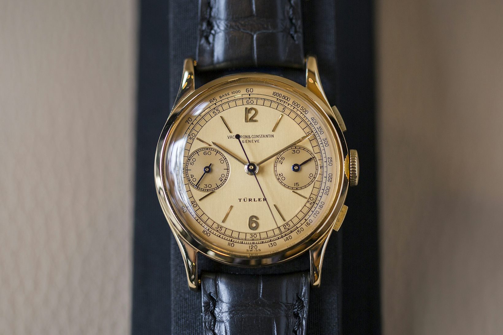
Vacheron Constantin chronograph, retailed by Türler, 1942.
There are two sides to this particular question. The first is how well the watch fulfills its intentions functionally. This may or may not weigh heavily in the final analysis, depending on the degree to which functionality is the primary goal of the watch. You can argue (and the dear Lord knows people do) that functionality and its handmaidens, accuracy and legibility, should be the primary raison d’être of any watch but this is not the case often enough for it to be worth noticing. For a pilot’s watch – and I mean an actual pilot’s watch, not a watch which is basically an illustration of a pilot’s watch – absolutely, if you cannot read it at a glance, ten points from Gryffindor.
For the MB&F HM3, on the other hand, legibility is manifestly not the primary consideration. I had one on loan from MB&F one year (in red gold) to wear at SIHH (remember SIHH?) and while it was never anything less than a chore to decipher the time (especially when you’re having your first glass of champagne at lunch and carrying on boldly and indeed, recklessly from there) it was one of the most flat-out fun experiences I’ve ever had wearing a watch.

The HM3 Starcruiser, 2009.
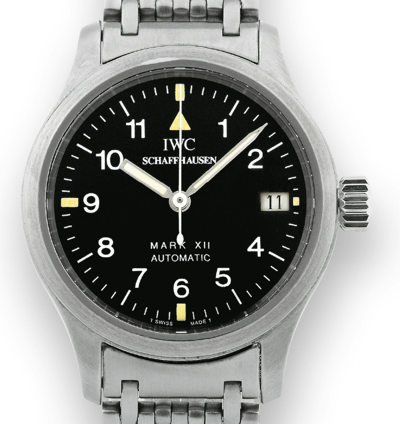
The second is how well a watch fulfills its intentions as a design object. Sometimes this, and not functionality, is the secondary consideration. The IWC Mark XII is one of the most beautiful watches of all time (at least, I think it is) but, it is so not because IWC said to themselves, “Hey, let’s make a classic of postwar industrial design which will set a new standard in functional elegance and stand the test of time.” (I don’t know … maybe they did say that at the start of the design process, but that’s probably not the way to bet. Though Walt Odets did say the Mark XII was “every non-pilot’s favorite pilot’s watch.”)
Instead, the Mark XII is beautiful almost by accident, in the same way a katana or the SR-71 are beautiful. Aquinas (who gets read less often these days than he should) says that three things are required for beauty: Wholeness, harmony, clarity. The Mark XII has those in spades, but they are the outcome of its singleness of purpose, and the disposal of everything not relevant to that purpose.
A Cartier Crash on the other hand, is clearly not intended, in the least, to be a paean to functionality. Instead, it’s something possible to evaluate a little bit more as you would evaluate an artwork. It’s a deliberate subversion of functionality, in fact, and therein lies the appeal. Another one of my all time favorites, the Tank à Guichets, is likewise obviously neither fixated on precision, nor on legibility – it is, however, one of the finest exercises in horology as an art of composition ever to come down the pike.
The next question is one near and dear to the heart of anyone who has ever considered spending money on a watch: Is it worth it? To parse this more finely, is the price appropriate to the execution, to the materials, to the sophistication of the design, to the effort taken to pursue precision, and to what the industry standard might be for the relevant competition?
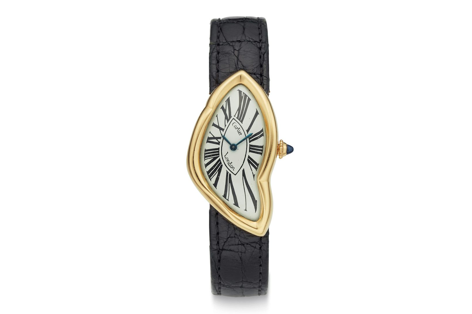
Cartier Crash, which set a world record of $225,000 at Christie’s in 2020.
A wise man (Watchbore, on Timezone.com, for those who remember) once said that the only possible answer to the question, “Is my watch worth what I paid for it,” is always “No” (although this is often not true of, say, tough Solar G-Shocks among other things). But if you have, for instance, an in-house chronometer certified movement, in a well constructed, solid water-resistant case, with good legibility and some sparsely but smartly deployed design cues which is under, let’s say, two thousand bucks, and which does you the courtesy of a five-year warranty, you’ve got an interesting value proposition. One of the most important messages a watch can send these days, even if it’s more or less subliminal, is that the maker, no matter the price point, cares about delivering value and real pleasure as much as it cares about the margin. It’s an easy thing for brands to forget.
Jean-Claude Biver once said to me that he thought the biggest problem facing watchmaking today is that so many brands and groups are run by people who don’t actually care about watches and that’s a deadly disconnect, which consumers can smell like the olfactory alarm of a leaking gas pipe.
Finally, there are the basic common sense questions about proportion and design. If the watch is a piece of primarily functional horology, it should still have pleasing and harmonious proportions as these are an actual aid to functionality. Why? Because the eye and the mind engage more readily with the harmonious than the ugly. A simple example is the length of the hands – if they are too short, or too long, then they don’t seem to interact naturally with the indexes and dial markers and though you might not articulate that to yourself specifically and consciously, you feel a sort of mental cramp every time you look at the watch. This is how watches end up getting sold on Instagram with remarks like, “Great piece but it just never clicked for me.”
If the watch is more closely engaged with design, does the choice of materials, proportions in design elements, and visual interaction between the design elements make for the ideal, which is an initial Wow followed by the pleasurable exploration of the details that make the Wow happen?
There are many, many examples of watches which are successful to one degree or another. Sometimes, though, you come across a watch which is so diametrically opposed to what you hold right, good, and virtuous in watchmaking of any kind, that you immediately reject it. There is nothing rational about it – you look at the watch and your vision swims with rage, your stomach churns with disgust. You can only say, in short, “To hell with it. Bad cess to this watch, and all who sail in her. Let it be hurled into an outer darkness, where there is a wailing and a gnashing of teeth.” (Warning: highly subjective, critically debased rant ahead).
For me such a watch is the Hublot LaFerrari. I am sure it has its fans but then again, Commodus, arguably the worst emperor ever to deface the Imperial Roman throne with his corrupt and profane posterior, never had any trouble filling the arena. It is a watch that instantly fills me with choking, speechless fury – the extended power reserve is rendered impossible to enjoy by the sheer silliness of the design, which looks as if it were created by an exhausted team literally compelled at gunpoint to produce something that fits the very lowest possible definition of cool – the sort of thing that a twelve-year-old bored out of their skull and besotted with Transformers would scribble on the cover of their Trapper Keeper during fourth period French.

Hublot La Ferrari, 50 day power reserve, launched in 2013.
I make no judgement of anyone who likes it – there is, I hear, no arguing in matters of taste. But in its juvenile celebration of Angular! Aggressive! You Won’t Believe Just How Big This Watch Is! it, to me, represents vapidly unimaginative, clichéd design at its very worst (best?). Calling something vulgar is hard to pull off these days – you come across as lacking the Common Touch – but by the seven heavens and the seven hells, I think it’s a vulgar-ass watch.
Of course, it is entirely possible, even probable, that for its target audience, this deliberately sophomoric mining of every design element that screams cool to a mind scrambled by the hormones of early puberty, is something to celebrate (and for sure they don’t think of the design cues as sophomoric either, I bet). I don’t often admit defeat when it comes to critical and fair analysis of a timepiece, but as a friend of mine once said, in a galaxy long ago and far far away, there’s no reasoning with this watch. It turns me from a broad-minded happy-go-lucky enthusiast into a bitter, humorless, small-minded pedant who doesn’t know how to relax and enjoy life a little, every time.
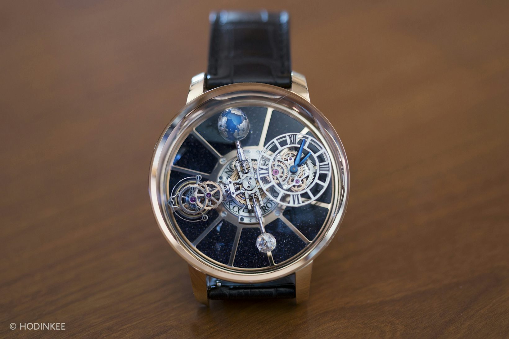
On the other hand I think the Jacob & Co. Astronomia Tourbillon is cool. Go figure.
So that’s it, more or less. And at the end of it all, the most basic foundation for me, of writing about watches, is that I like them. I have been interested in watches for maybe forty years and have written about them to earn my avocado toast for at least twenty, and I still find them endlessly fascinating. And to be completely honest, if by some twist of fate I had a chance to do A Week On The Wrist with the Hublot La Ferrari, I would jump at it with both feet, wrist at the ready. There is nothing more fun than challenging your own tastes.
(I will never like Damien Hirst, though. Ever. Not gonna happen).

Get More Articles Like This in Your Inbox
We're constantly creating great content like this. So, why not get it delivered directly to your inbox? By subscribing you agree to our Privacy Policy but you can unsubscribe at any time.